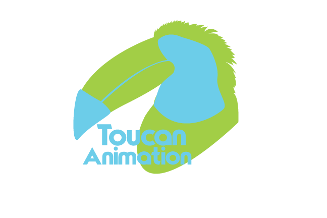
Objective: Create a working design using only two lines and focusing on the gestalt theory.
Direction: Used the two lines to create a two color logo for a fictional company that resembles a toucan.
Likes: Shapes turned out okay.
Dislikes: Without the effects added to the logo text doesn't pop on the green.
Time: 4 Hours
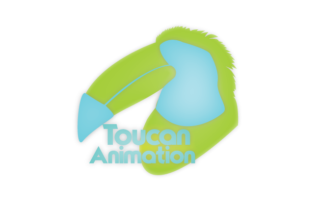
Direction: Used the two lines to create a two color logo for a fictional company that resembles a toucan.
Likes: Shapes turned out okay.
Dislikes: Without the effects added to the logo text doesn't pop on the green.
Time: 4 Hours
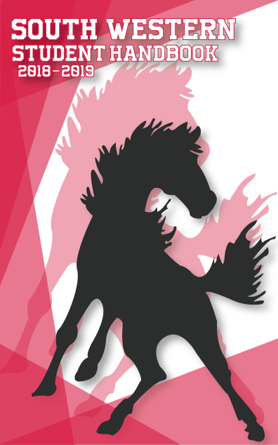
Objective: Develop a Cover for the 2018-2019 Student Handbook
Direction: Created a simplistic lighter colored design based around object transparency and overlapping shapes to create multiple shades of red while maintaining an informal balance between other items on the cover.
Likes: Color choice makes for a light easy to look at cover.
Dislikes: With more time could've experimented with different horse designs and outlines
Time: 5 Hours
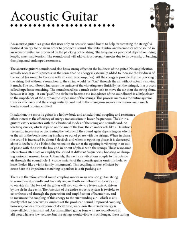
Objective: Practice creating text wraps in InDesign by wrapping an article around an image of an acoustic guitar
Direction: Created a box around the guitar for the text to warp to on the right side
Likes: Curve of the guitar creates an interesting manipulation of the text paragraphs
Dislikes: Text is bland, could have used a different font or page layout
Time: 30 Minutes
Direction: Created a box around the guitar for the text to warp to on the right side
Likes: Curve of the guitar creates an interesting manipulation of the text paragraphs
Dislikes: Text is bland, could have used a different font or page layout
Time: 30 Minutes

Objective: Practice creating text wraps in InDesign by wrapping an article around an image of our own choosing
Direction: Used Wikipedia information on the double neck guitar and wrapped it around a tilted image of a double neck guitar
Likes: Curve of guitar body creates interesting text movement
Dislikes: Angle of Guitar puts text at a weird downward angle
Time: 30 Minutes
Direction: Used Wikipedia information on the double neck guitar and wrapped it around a tilted image of a double neck guitar
Likes: Curve of guitar body creates interesting text movement
Dislikes: Angle of Guitar puts text at a weird downward angle
Time: 30 Minutes
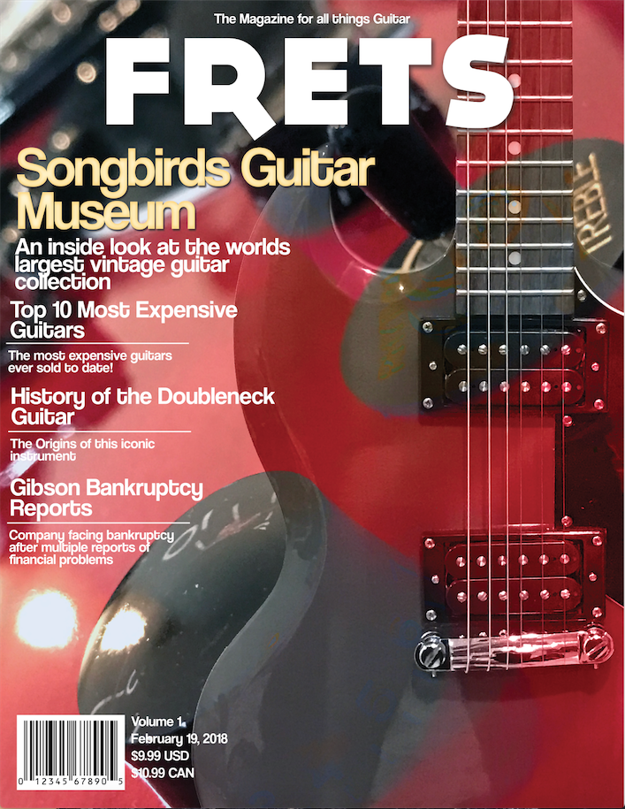
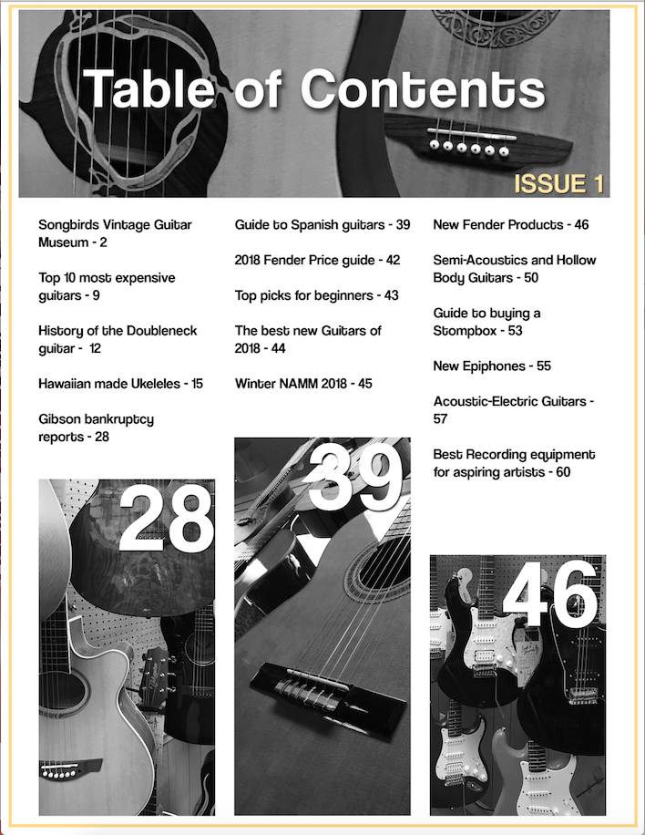
Objective: Create a Magazine Cover for a fictional magazine with all original photos and story's
Direction: Created a Guitar magazine named Frets with various pictures of my own guitars and pictures from a nearby guitar store, used my bright red Epiphone as the cover as it draws attention
Likes: Cover design looks professional and stands out
Dislikes: Table of contents color scheme was inconsistent so it had to be muted to look presentable
Time: 7 Hours
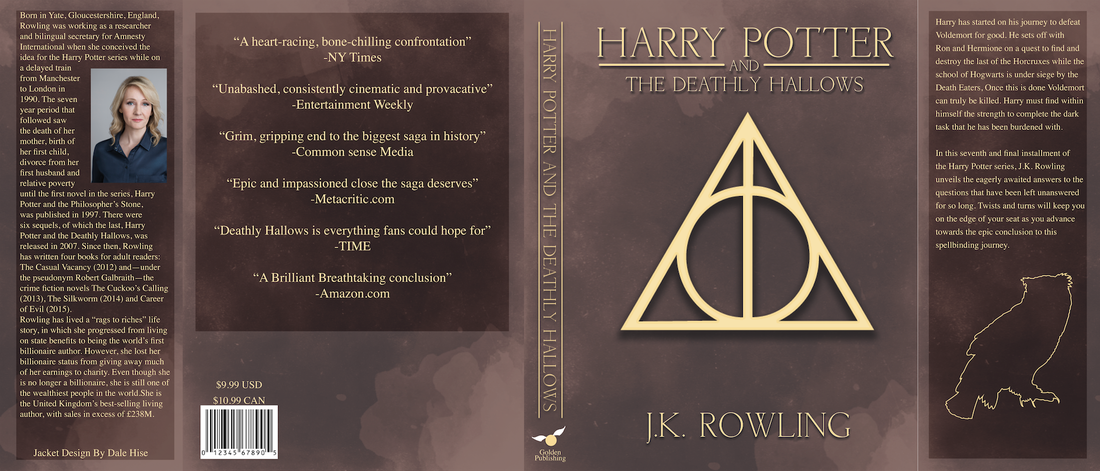
Objective: Create a book jacket for a book you have read
Direction: Did a cover for ''Harry Potter and the Deathly Hallows'', simplistic designs and text on a waterstained background I created in Photoshop
Likes: Background turned out nicely, Boxes for text that darken the background fit the theme well
Dislikes: Pale yellow color used in images and text could be changed slightly to look nicer
Time: 7 Hours
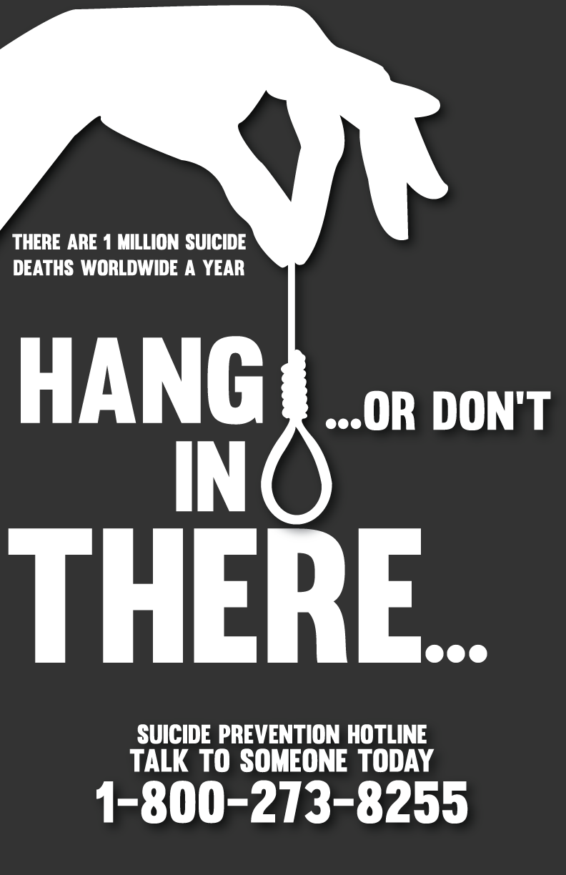
Objective: Create a poster raising awareness for a cause of your choosing - For take a stand week
Direction: Used all white font and imagery on a black background so as to stand out, main text is a double entendre with sub text providing information on suicide and the hotline number.
Likes: Color choice contrasts well and stands out
Dislikes: Some text placement could have been better
Time: 1 Hour and 20 Minutes
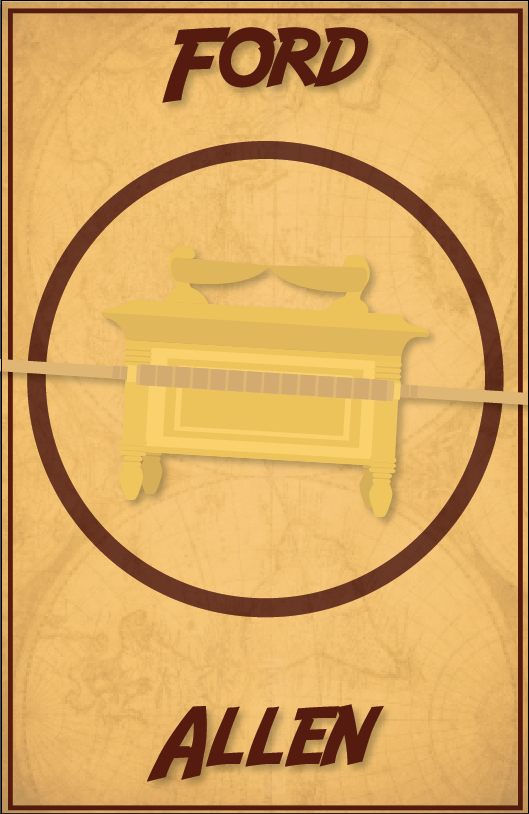
Objective: Create a simplistic poster that represents a movie without using the title
Direction: Chose to do Raiders of the lost Ark, created the ark of the covenant in illustrator and put it on a background of a world map with the two lead actors last names
Likes: Simplistic style of the ark turned out nice and is pleasing to look at
Dislikes: Color choice could have been better
Time: 1 Hour and 20 Minutes
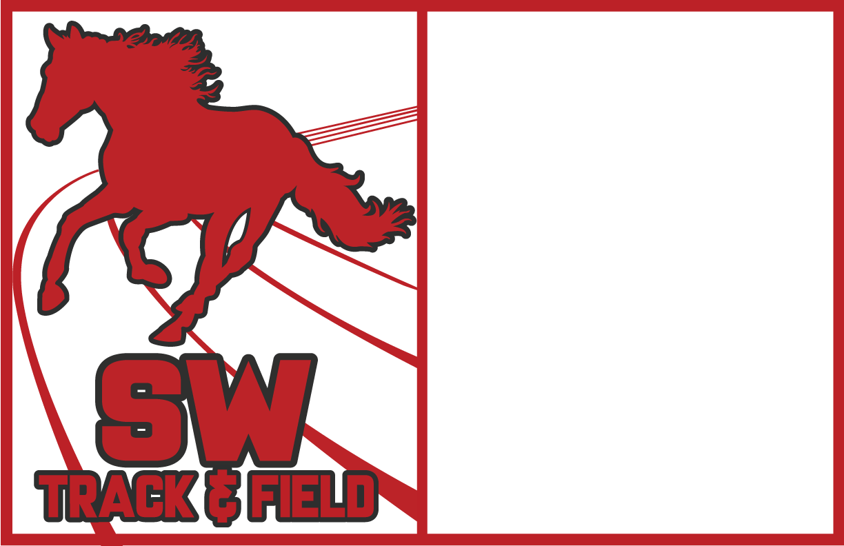
Objective: Create a 2 color offset printed schedule
Direction: Created a 2 section schedule for track and field with an image and bold text on the left
Likes: Font choice and text stand out
Dislikes: End print not as good as a computer image could've been
Time: 8 Hours
Direction: Created a 2 section schedule for track and field with an image and bold text on the left
Likes: Font choice and text stand out
Dislikes: End print not as good as a computer image could've been
Time: 8 Hours

Objective: Create a halftone print on a T shirt from an image of your choosing
Direction: Used an edited image of a vintage car in black ink on a white shirt
Likes: Contrast of car on white shirt looks good and apply's emphasis to the car well
Dislikes: Could've tried a higher halftone dot count
Time: 7 Hours
Direction: Used an edited image of a vintage car in black ink on a white shirt
Likes: Contrast of car on white shirt looks good and apply's emphasis to the car well
Dislikes: Could've tried a higher halftone dot count
Time: 7 Hours

Objective: Create a 2 color hand-cut screen printed card
Direction: Used an image of an Ewok from star wars on a rocky platform, colored the brown of his robe
Likes: Print job went well and the colors lined up better than expected
Dislikes: Could've used more colors
Time: 8 Hours
Direction: Used an image of an Ewok from star wars on a rocky platform, colored the brown of his robe
Likes: Print job went well and the colors lined up better than expected
Dislikes: Could've used more colors
Time: 8 Hours

Objective: Digitally colorize an image of your choosing in photoshop
Direction: Used a star wars bounty hunter and tried to make it look good using overlay textures
Likes: Fabric texture doesn't look terrible
Dislikes: Colorization overall didn't turn out well, needed more time to figure out how to accurately color in photoshop
Time: 7 Hours
Direction: Used a star wars bounty hunter and tried to make it look good using overlay textures
Likes: Fabric texture doesn't look terrible
Dislikes: Colorization overall didn't turn out well, needed more time to figure out how to accurately color in photoshop
Time: 7 Hours
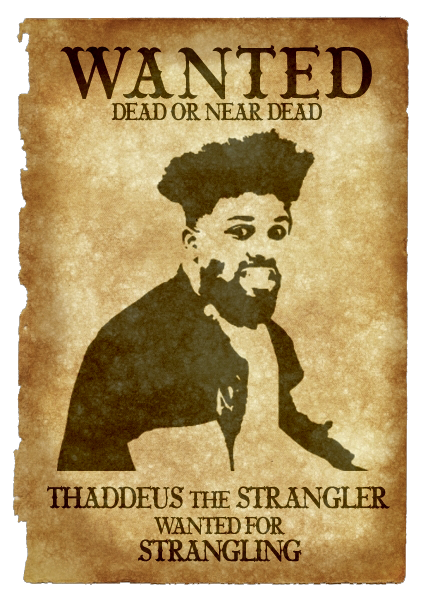
Objective: Western Wanted poster tutorial
Direction: Took a picture of thaddeus and accused him of strangling
Likes: The black text and image overlayed on the background creates a nice effect
Dislikes: With more time could've smoothed out the image more
Time: An hour and 30 minutes
Direction: Took a picture of thaddeus and accused him of strangling
Likes: The black text and image overlayed on the background creates a nice effect
Dislikes: With more time could've smoothed out the image more
Time: An hour and 30 minutes
